

Over the past few months, we have researched the gap in RRSlide. Our marketplace in which still far from perfect. It has become more apparent that we hope to update its UI/UX to support designers and creators to get the products they need.
Well, in some ways, the time had come. While we were among the PowerPoint marketplaces that popularize versatile template needs, we wanted to do the growth hack for RRSlide. We wanted to be unique. We wanted to be remembered by our users. And more than that, we wanted to get involved in what people will do with presentation design in the future.
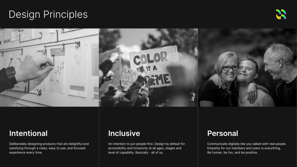
But actually, there is more than that. We have established a new sitemap, wireframe, and branding concept and repurposed everything we have to make it happen. We have also continued to add 1000 freebies, reduced bugs, and worked to position our market with a more affordable pricing plan.
Want to figure out the whole thing? Here is a round-up of what we have been working on.
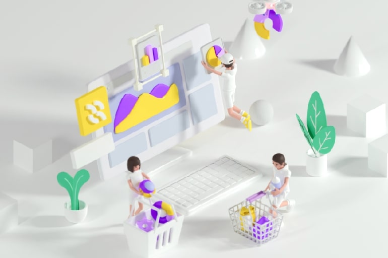
Exploration is more fun
We used to have devastating traffic, to the extent that more than 70% of users won’t come back to our site. It is a nightmare for us. We collected assumptions to think about what matters the most for RRSlide, and agreed that the bounce rate issue must become our core focus to tackle.
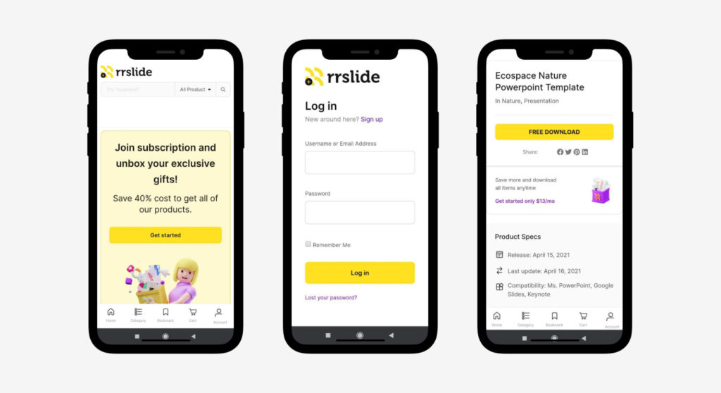
As a marketplace, we believed that users already had a goal in mind when they landed on RRSlide: buy PowerPoint templates. As a buyer, they usually will explore our display window in the beginning.
They will keep exploring all menus, buttons, and navigation to find their desired stuff. And they will give up if they can’t find any.
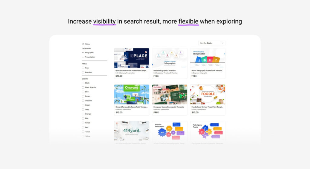
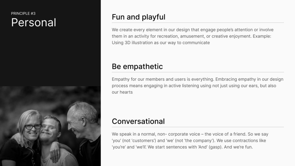
To help them meet with the products they wanted, we established the so-called “filter.” With it, users can exclude or include the qualities of our items based on scopes, colors, and prices. We give our users the ability to narrow down, specify, and change the results of many various things. This eventually increases the search result visibility. We also add extra flavors to our copywriting by using a non-corporate voice—the voice of a friend. Also, we wish people could be persuaded with whatever RRSlide is trying to provide, but in an emphatical way.
All in all, everything is wrapped up with a new look and feel, a fresher interface with a banana-like color palette, and seamless 3D illustrations as our efforts to communicate.
Cheaper, but better
We researched our competitors in the same niche and figured that many marketplaces are overwhelmingly shared free products or freebies. The number of their freebies is no joke. Thousands! But you shouldn’t expect their quality, that is quite ironic with their quantity.
Then there are also some famous platforms with their annual subscription thingy. They have premium products that only can be accessed by special membership. Sounds tempting? It does until you realize that they barely make the product update. You will run out of money in return, and your investment will be good for nothing because their marketplace stays in place.
This makes us rethink what the best market segmentation for RRSlide is? Who are our end-users? How should we treat our buyers?
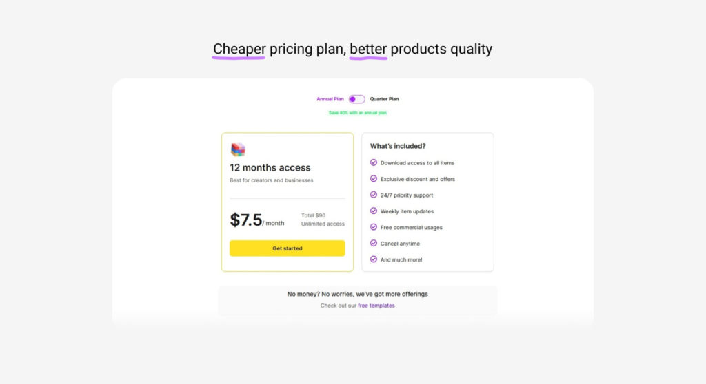
First, we want to target designers and creative teams in a company. Second, we can’t neglect that freebies seekers are a lot, and we want to include them in our top funnel. We assume there is a chance for RRSlide to grab both audiences. We are confident that our products are better in terms of quality. More than that, we also have tons of product stock, ready to be uploaded anytime.
So the idea is that we go with $0-$15 pricing plans for 1000+ freebies and 350+ premium items ready to download. We believe that is a reasonable price, especially since we also have a $7.5 monthly subscription. It isn’t even more expensive than a cup of cappuccino in your favorite cafe. Cheaper than ever.
Items every week, every niche
Many platforms are merely serving the needs of business people. This is shown by their product per se, a presentation template that looks very formal and basic. The one with a blue-ish color scheme has flat infographics.
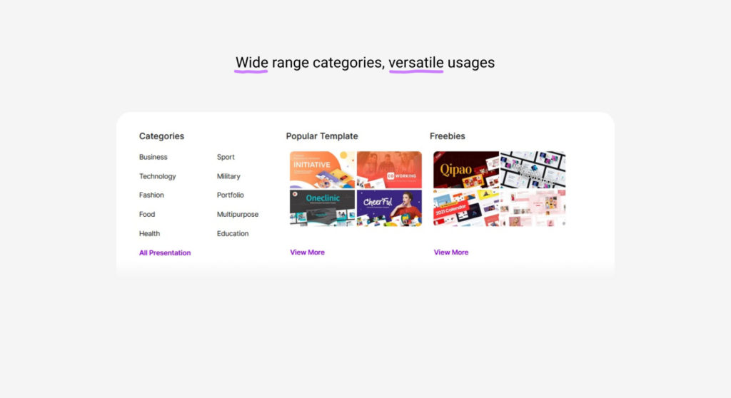
Meanwhile, in RRSlide, we are trying to cover a wide-range niche. From education and culinary to a presentation template for an art exhibition. We are also following the current design trends in making a template. Let’s say neumorph, gradient, cyberpunk, and so on. This makes our items stay up-to-date and evergreen.
Our in-house designers create every template. And one template is a craftmanship result of one designer.
We give them freedom throughout the process to make anything they want. So, you may notice that we have a great variety of items, with different tastes and styles. Altogether, there is also a quality assurance team to manage when the article will be published, how it will be delivered, and to think of a catchy name for the item itself.
To make everything run effectively, the workflow across the teams must be perfect. And we have embraced that sort of value from the very beginning until our finishing touch. That is why we dare to say that our products finally can be received by everyone universally, not only for now but also in the future.
Download anywhere & anytime
Mobile-friendliness is our success metric in this matter. It is because everything can be moderated with a smartphone nowadays. Everyone also has that device in their pocket, which they also bring it anywhere. Getting those facts, we don’t want to miss that chance to give our users a more sense of accessibility.
It is never easy to convert the 16:9 desktop view to look compact on your phone. There are particular aspects to consider in a most detailed manner: grids, buttons, and horizontal swipes.
Everything must be delivered intuitively and designed in an adequate size for your thumbs.
Fortunately, we can pull strings out of it. Hence there are no disposable elements in RRSlide mobile version. Every feature can be displayed with simplicity using the proper proportions. And the overall look turns out to be frictionless. We have seen through one of our objectives—to let every user download our items anywhere and anytime, regardless of the device they have.
Behind the redesign
When we were in the early stages of redesigning RRSlide, we partnered with Floater. They are a small UI/UX team belonging to Ferdi dan Dhika. We wanted them to challenge our initial assumptions about how the product, which is e-commerce, should look and feel. They became an extension of our internal team, helping us conduct user research and bring new perspectives to its design.
It took approximately three months to create a sitemap, wireframe, and run testing. The time is longer than we expected because defining the redesign goal is somewhat hard to do. Everyone wants to be heard. Everyone wants to take part. And each of the ideas can’t be seen as more minor than the others.
And here let us show you what we have got:
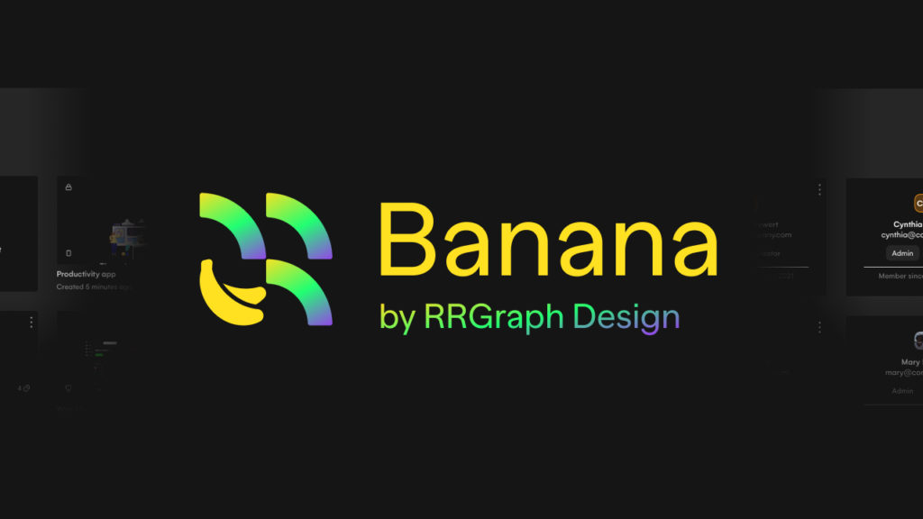
That extraction process also triggered us to build a “Banana Design System.” It is intertwined with RRGraph and RRSlide, which previously didn’t have something that ties them up altogether. Having a design system has become urgent because we will launch a more diverse product shortly. Our brands still don’t have clear guidelines. This leads to inefficiency of development time and discrepancies between visual effects. And it will be wrong if we can’t deliver it with a strong visible presence. Hence this fresh-looking design system hopefully can uplift the value of our products and brands, shape the way we work every day, help us make tough design decisions, and distill many iterations into the best solution.
Lastly, but also the most crucial, is the development process. We rely on our best engineers, Shandy and Rizal. Without their willingness to dig more into codes, anything we designed will only end up as pixels and won’t bring any solutions for users.
Visit RRSlide now
Bad design upsets our users. Unhappy users mean less money. Less money means the end of our business. All we had to do was pay well for a good design. That is why we redesigned our flourishing marketplace.
Let’s visit RRSlide to download free PowerPoint templates. But wait, don’t go anywhere and stay here with our Blog to keep up-to-date on all the best pitch deck template collections and design advice from our PowerPoint experts!


