

Creating insightful landing page design is the key pillar of successful online marketing. With it, our product may be peachy and our PPC ads can bring more conversion.
Needless to say, the landing page must be flawless otherwise our business will be bound to suffer.
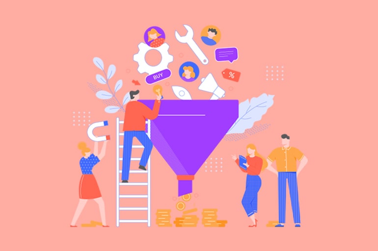
What is a landing page design?
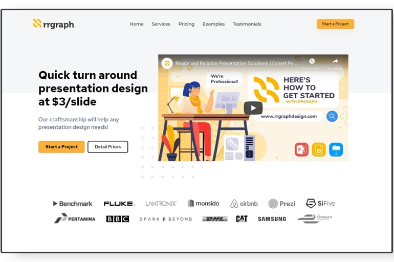
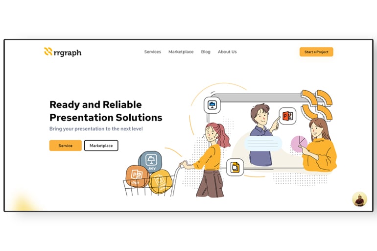
A couple of us may be friendly with several homepage screens from a website. Dare to say, people are unfamiliar with the term “landing page” mostly. Well then, just look at the image below:
From this, marketers generate leads that are linked with email and so on. Those leads convert into buyers or subscribers. So doing of converting into buyers is usually wrapped up by Call-to-Action buttons and lead generation forms.
Mark these words, “every-user-is-unique”. Thus, the grabbing-attention CTA button on the landing page is a really essential element for marketing tactics and efficient advertising to reach soon-to-be users as much as we can.
See also: 10 Essential Landing Page Elements to Optimize for Better Conversions
So how to make a landing page design?
Making a landing page design for our website from scratch is such a difficult thing, we have to admit it.
Here we give you 10 landing page design tips to be implemented on your website to finally boost more sales.
Simplicity for the win
Likewise, the message is clear and concise with no stuffy words. And the whole layout is neat and preppy. We can’t go wrong with that.
Visual simplicity takes a landing page design into minimalist and attractive. Here are some types of visual simplicity:
- Avoid redundant visual elements, and use a clean white space or plain color combination.
- Choose a big and cool font to make it readable.
- Create contrast by showing elements in a way that makes them stand out.
- Reduce design proportion to avoid the page being loaded.
All-in-all, the visitors are the king and they may not be calm, they just want to hit the bottom with ease. Make your landing page work simply!
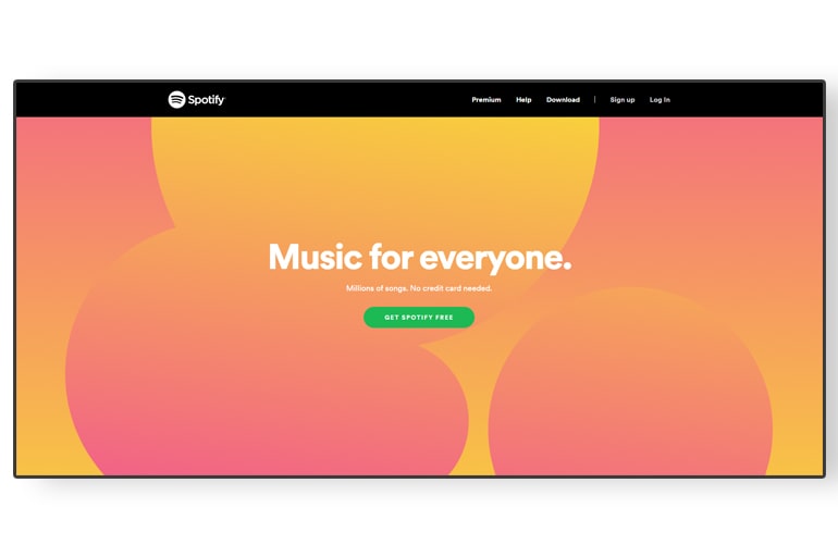
Always starts with visuals
You-all kindly visit this page and look at how they create a catchy video to bring memorable experiences with the brand.
The study stated that videos have more impact than still images, where “71% of respondents confirm that video converts better than other content.” Videos help with SEO, control user engagement, and better in advertising the product or service to visitors.
A great video offers amusement, brings value, and demonstrates the product effectively. It drives visitors to click a call-to-action button you want them to look at and take action.
Color never dies!
It is a fact that colors are a big influence on our behaviorism, on the way we feel and act.
Here are some tips to play colors in a way:
- Use high and low colors that support the creation of high contrast.
- Create a color palette that is compatible with color blends.
- Adjust colors from the perspective of psychology and marketing.
- Know the culture of color interpretation, what works for one user may not work for another.
To sum up, appropriate color palettes increase the user experience and help to guide them in understanding our product.
It is not just content, but the context
We are busy using difficult phrases and many words. Reflect this, “Spot yourself as a customer in making decisions. As user experiences, words must be made from the user’s perspective.”
Frankly, we write in a too-product-tech mind. For instance, we want to release a new feature with the e-mail subject “Now you can access our new notification feature!” It is still within the framework of the product perspective. We try to ‘tweak’ it! So that it can be replaced “Checking notifications now is easy”.
Catchy-friendly headline
Headlines are a starting point that visitors see. It is a “hook” that either catches or loses the visitors.
Besides showing an impression, the headline is an element that stands out as the essential message and the unique selling proposition. An effective landing page headline should be:
- Persuasive and straightforward
- Brief but clear, and states what issue must solve
- Brings a sense of urgency
Have a peek at some catchy slogans here to get examples of effective advertising!
Create a buyer persona
Knowing their personality, age, habits, budget, education, career, and other characteristics will help us to sell a product in the right way.
All the above is required to do customer surveys and online research, of course. That is why we must first create a buyer persona before getting started with our landing page.
Key elements you must know
The content on our landing page must be on fleek and highlights our unique selling proposition (USP). The content we offer will depend on the type of product or service we are selling.
Generally, the landing page consists of essential element options, such as the headline, heading, subheading, lead generation forms, services/products, benefits, how it works, the offer copy, the CTA, then social proof, and more.
Learn A/B testing
It is not enough to make a landing page. We also need to check whether it works or not. To test whether our landing page can do conversions, the answer is A/B testing performance. It is to collect valuable analytics on how users interact with the landing page.
In the end, testing A/B performance exactly depends on the origin of the traffic. For example, we can test how often visitors clicked the button, watched a video, or submitted the lead form.
Exactly, we can apply A/B testing to these sections, such as headings, CTAs, images, graphics, buttons (look, text, and location), trust signals, press quotes, placement of page elements (blocks), or navigation links.
Create compelling CTA
We need to know the reason to create the Call-to-Action (CTA) button in the first place. This is because CTA is the main point before a person submits information or goes to the payment.
This part usually takes the item of filling out a form, or survey, signing up for a free trial, downloading a free product, ordering a product, registering a new member, subscribing to a newsletter, and much more.
According to WordStream, the best CTAs are:
- Use catchy action words, such as “get and give”.
- Make a sense of trust, like “Let’s build your offer”.
- Attract a sense of urgency by showing visitors about benefits after submitting the lead-generation form, e.g. “Get a 30-day trial instantly”.
Remember! Avoid using simple phrases like “submit” and “send”. Indeed, it is not properly used since can make users worry to click.
Social sharing is essential
Social sharing icons become a type of word-of-mouth about your brand satisfaction. To avoid a chaotic, provide only buttons for social platforms to target users’ needs.
As the references, there are so many different types of social proof, such as testimonials, case studies, ratings and reviews, influencer endorsements, certifications, brand logos, client logos, subscriber counts, and more and more. Whatever suits you, just do it. And don’t forget to use pictures!
See also: What are the Key Components of a Landing Page Design?
To wrap up
We can grasp that a landing page design is an essential tool and show a unique opportunity for entrepreneurs to expand their marketing campaign. After this, go find yourself a way to create a landing page design like a pro.
Dig much income like crazy, you deserve it! Then come back here and tell us if it is worked well. You can also check DIY Tips on Sisters Grimm.
To end up, leave your comment below to share your own “landing page secret”. We believe it can spread more wonderful benefits for everyone. Do you want to discover some thoughtful articles? Dig here.


