

It’s hilarious to see that along with the shifting of the Gregorian calendar, every designer and marketer uses a weapon called “Trend” to brainwash people in order to follow their directions to look cool.
As stated in Toptal, Designers will encounter a greater number of clients desiring to make ethical design a top priority.
In turn, those designers will become familiar with ethical standards while learning how to examine design decisions through the lens of ethical frameworks.
And that’s how 2020 presentation design trends are created.
Needless to say, don’t you think that they’re such Mr. Know-It-All?
We, ourselves as PowerPoint design experts paradoxically either. We tried to make coverage of what becomes trending every single year.
And now you probably think that we will share about 2020 Presentation Design Trends.
Yep, that’s true. Up until now, we can’t get out of that pettiness. We tried to foresee and acted to be innovative, and that actually is overwhelming.
Next year, PowerPoint will have its 33 years anniversary. So, happy birthday! (I think it’s fine to say it first.)
According to the Newton scale, 33 is the temperature at which water boils.
In the human age, it can be described as the stage of maturity. So does happen to PowerPoint. This tech has been updated for a number of users from business marketers, to school teachers, to visual art performers.
Since the flooding of PowerPoint usage occurs, then a chance for its ineffectiveness opens. More specifically among us, designers, who create a new formula of coolness.
They’re a bunch and bunch of design trends we’ve created. Sadly to argue, it makes the word ‘trend’ itself no longer powerful.
Trends are appalling, nevertheless however long they last, there’ll be a new trend to replace the old.
That’s why 2020 isn’t about the trend.
I opened up the dictionary and find this term: Relevant. Does it sound more acceptable?
Relevant refers to what is appropriated during that particular time, it needn’t be new, but simply make sense.
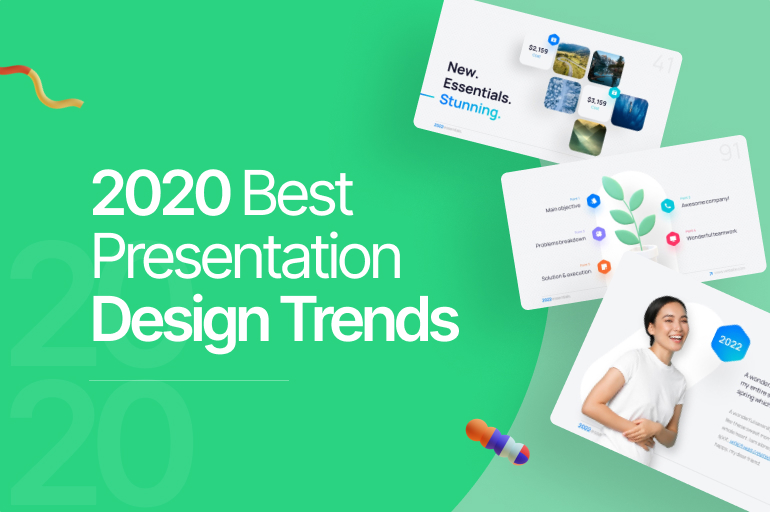
And here is the list of things you probably find relevant next year:
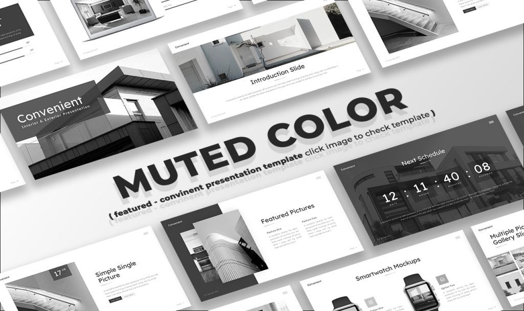
2020 Presentation Design Trends: Muted Color
Many of us have been mix-and-matching the palette to attain the so-called duotone.
That high-contrasted color makes our retinas work harder. It’s cool and never gets old.
Duotone can quite define optimism, like a highly enthusiastic teenager who wants to stand out with an edgy make-over, before facing quarter-life crises.
Thankfully, the dishonest design has been exposed to the glare of public scrutiny, prompting businesses and designers to carefully weigh the ethical implications of their design decisions.
2020 presumably will be quieter. It reflects human approaches with some of strengths and weaknesses, where the design doesn’t bother with extraordinary color customization.
Thus, the naivety color is selected. Coated with low contrast, it has a less arrogant ambiance. Some say as monochromatic.
See also: 5 Design Trends That Aren’t Cool Anymore
2020 Presentation Design Trends: Content Emphasize
In this digital age, here’s a commitment to the customer-first approach. From a different angle, it means that you have recognized customer wants without knowing them beforehand.
In the PowerPoint world, the customer is the audience. They watch presentations for ideas. Nothing else.
This eventually brings back the PowerPoint essence, as Gaskin, a tech celeb, said in the interview, “I say what Queen Gertrude says to Polonius (in Act 2 of Shakespeare’s Hamlet): “More matter with less art!” That is, more intellectual substance, with less rhetoric and gratuitous decoration.
Anyone worth talking to will closely analyze your ideas, not your stock photos or fonts or clip art.” You’ll be regretted to look at that statement. Because he’s the PowerPoint inventor himself.
Texts, bullets, and numbers must convey context.
All of them will be tattooed in the mind of your audience. In a way of making it possible, you can use one of these tips:
Text Bolding
What do you see first in the slide above? If you see its title, then it works.
A bold font weight makes the letters of a text thicker than the surrounding text.
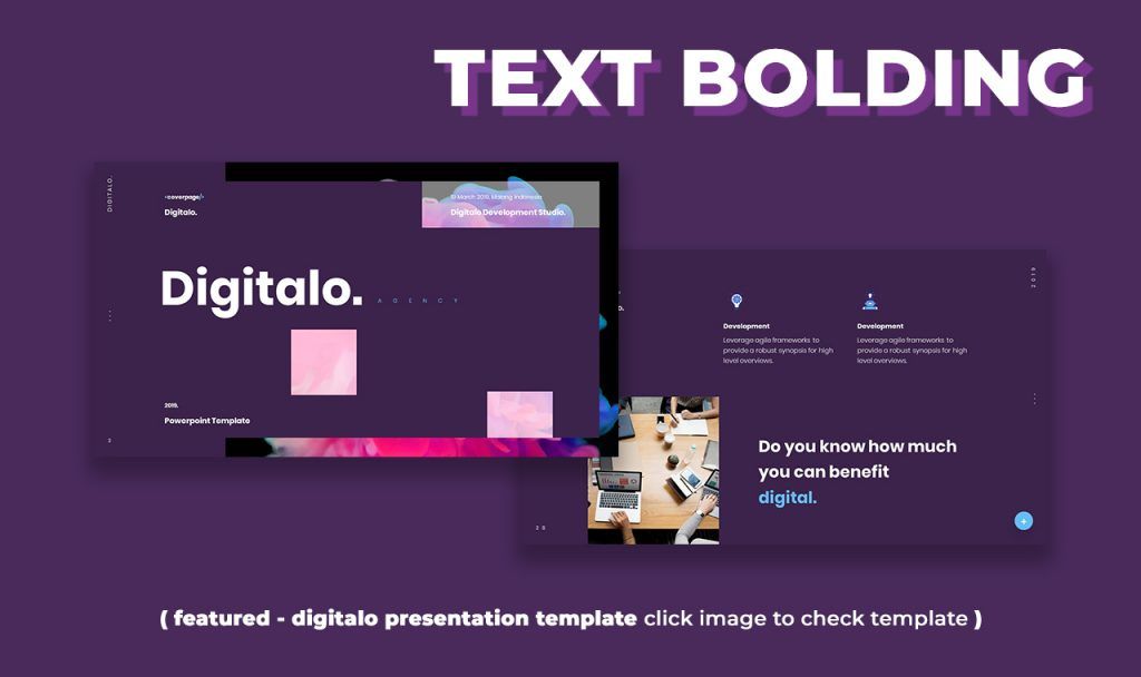
In this way, you can direct the audience’s attention, to make them look at your keywords radically. Then and there, logos will be temporal too.
3D Visual Object
This is more revolutionary than dustpan shoes.
The Walt Disney Studio dominated the cartoon industry in this way.
It’s a spectacular way to grab your audience’s attention with a little space in your slide.
Also, the most satisfying, it can orbit like a planet.
Simplifying Vector
If you really savvy to place it in your presentation, you’d better make it as simple as a sesame seed at top of your burger.
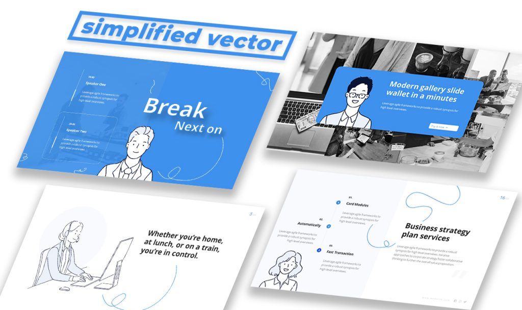
It’s a compelling concept, but the functionality of lite mode is somewhat clunky, and there are times when it blocks key PowerPoint presentation features or fails to display important information.
So just make little, but needed.
2020 Presentation Design Trends: Sublimation
Image over text, not text over the image.
This technique called masking has the function to hide and show portions of pictures. It may be the trick to fine-tune easily, especially with wide lettering.
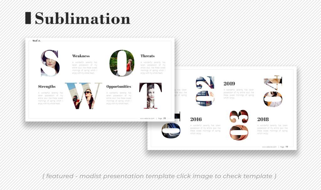
Even if the effect is sublime, it could bring the balance between natural and artificial.
Just like seeing from a clear window.
See also: Glassmorphism Presentation Templates 2022: New Design Trends with Glass Morphic & Overlay Glassy
2020 Presentation Design Trends: Genuine Data Makers
Let’s say goodbye to dummy charts and infographics! It is impossible to edit a dummy. Unprepared people usually show it.
Here’s a shortcut to obtaining the organic infographic assets you could use multiple times in your PowerPoint.
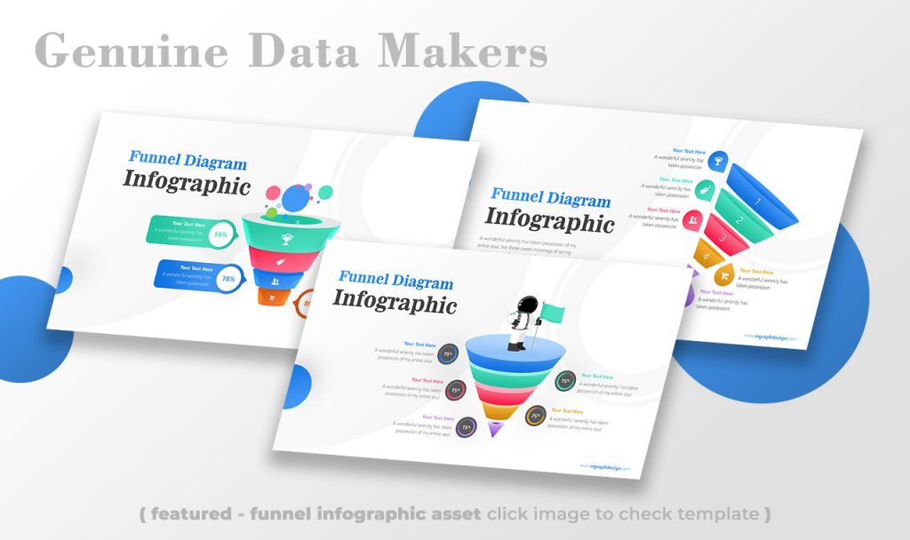
In the presentation, the goal is to make honest and rich sensory data available to the individual content originator. From the example above, you can see what’s so-called a Funnel.
It’s perfect to describe how something transforms into something else and the deeper, the more prominent it gets.
See also: 10 Top Presentation Design Trends 2021, Bye Minimalism!
2020 Presentation Design Trends: Biophilic
After minimalism taking part in a recent lifestyle, the movement continues to be more eco. Edward O. Wilson coined the term biophilic, an extension of biophilia.
Wilson in the 1980s hypothesized that humans have an innate, biological affinity for the natural world. It taps into society’s concerns about plastic, global warming, and other sustainability issues.
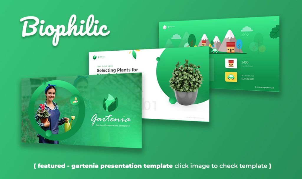
In the matter of visual look, the way of embodying this design is by applying hues of green, exploring organic shapes, and placing numerical arrangements that persist in nature.
Blue is certainly classic. It’s calm, comfortable, and reassuring—just like a pair of Wranglers. But good old blue isn’t the color that will dominate 2020.
Something that is foresty or beachy, that the combination has a coastal overlook. Because humans today spend 90% of their time indoors it’s necessary to bring the outdoors in subtle ways.
From interfaces to interiors, expect to see Mother Nature’s favorite hue infiltrating design decisions in all disciplines.
Need a specific shade? Look no further than dark seafoam green, a color readily found in plant life and natural phenomena.
See also: 8 Possible Presentation Design Trends 2022 We Need to Prepare
Conclusions
Wellness, that’s how I sum up the next decade. 2020 (re: twenty-twenty), can probably be the year of taking a break.
“20” is that it is the maximum number of moves to solve all possible positions of a Rubik’s Cube. Correspond with our civilization, that has reached the maximum.
Today, we merely need to set boundaries for new discoveries since we’ve inherited uncountable things a long ago, and to think again about what’s relevant or not.
That’s our silver pennies for the 2020 Presentation Design Trends.
Let’s visit RRSlide to download free PowerPoint templates. But wait, don’t go anywhere and stay here with our RRGraph Design Blog to keep up-to-date on the best pitch deck template collections and design advice from our PowerPoint experts.


